Autorský popis
- Na zákazníka orientovaný interiér.
- Absencia vizuálne „hluchých“ miest.
- Transparentná dispozícia - cukrár - kuchár je súčasťou zážitku, je to prvá vec, ktorú zákazník môže vidieť pri vstupe a v druhom pláne za zábarím je stále súčasťou interiéru. Komunikujeme tým transparentnosť procesov, hygienu a remeselnosť.
- S riešením interiéru sme sa sústredili na na veci, ktoré „predávajú“, čo znamená prichádzaju do kontaktu so zákazníkom - tie ktorých sa dotýka (stolové dosky, čalúnenie) - tam sme použili kvalitné, ťažšie a trvanlivejšie materály.
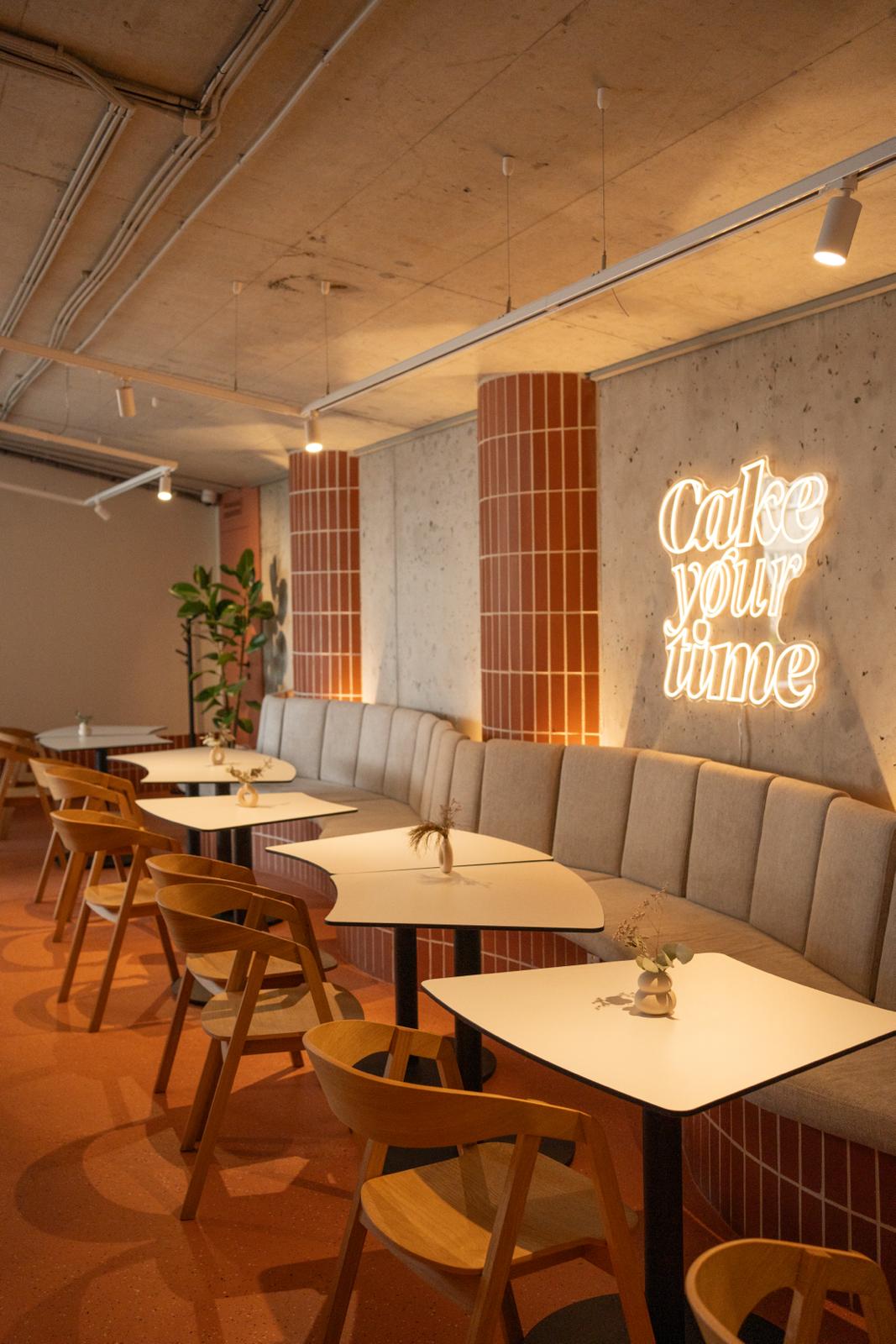
- Potom sme ďalej citlivo pracovali s vecami, ktoré zákazník môže vidieť - všetky možné pohľady, priehľady, aby tam vznikali jasne pomenovateľné objekty - v podstate solitéry - čo je znakom pre zrozumiteľnosť interiéru: stena s policou, stena s neónom, stena so zrkadlovým logom, bar- kuchyňa, sedacia vlnovka. Pri príliš veľkých celkoch, ako je zadná železobetónová obvodová stena, sme potom pristúpili k rytmizácii v malom počte intervalov a akcentu prirodzených elementov ako je stred rytmu steny, aby sa do priestoru vniesla opäť hierarchia - pre uchopenie zmyslami zákazníka. Čiže on bude vedieť, že sedí pri stolíku za druhým pilastrom od loga.
- Vizuálne napätie, ktoré prirodzene vzniká na všetkých rohoch a hranách sme na mnohých miestach modulovali ukončením rohu štvrťkruhom - a preto napriek prísnej ortogonálnej geometrii dispozície, priestor nepôsobí tvrdo.
- Dôraz na chromatickú kvalitu osvetlenia, a tiež aby zákazník nebol niekde oslepovaný bodovými zdrojmi.
- Sedenie pre zákazníkov je rôznorodé a zónované, uzkostlivo sme sa vyhýbali takzvanému „jedálňovému efektu“, ktorý vzniká pri prĺišnom opakovaní rovnakej situácie stolovania nezakotvenej o žiadne pevné a bezpečné línie.
- Prepojenie exteriér interiér aj v kolorkóde nábytku
- Presvedčili sme sa s majiteľkou, že nedokonalé technické elementy, ako sú obnažené inštalácie elektro a VZT pod stropom, keď zákazník sedí a dotýka sa kvalitného a príjemne osvetléného, neprekážajú príjemnému pocitu v prevádzke.
Author Description
- Customer-oriented interior.
- Absence of visually "deaf" places.
- Transparent layout - Pastry - chef is part of the experience, it is the first thing that the customer can see when entering and in the second plan behind the counter it is still part of the interior. We thereby communicate the transparency of processes, hygiene and craftsmanship.
- With the interior design, we focused on the things that "sell", which means they come into contact with the customer - those that he touches (table tops, upholstery) - there we used high-quality, heavier and more durable materials.
- Then we continued to work sensitively with things that the customer can see - all possible views, overviews, to create clearly nameable objects - basically solitaires - which is a sign for the comprehensibility of the interior: a wall with a shelf, a wall with neon, a wall with a mirrored logo , bar- kitchen, seating wave. In the case of excessively large units, such as the rear reinforced concrete perimeter wall, we then proceeded to rhythmize in a small number of intervals and accent natural elements such as the center of the rhythm of the wall, in order to bring hierarchy into the space again - to be recognized by the customer's senses. So he will know that he is sitting at the table behind the second pilaster from the logo.
- We modulated the visual tension that naturally arises at all corners and edges in many places by terminating the corner with a quarter circle - and therefore, despite the strict orthogonal geometry of the layout, the space does not appear harsh.
- Emphasis on the chromatic quality of the lighting, and also so that the customer is not blinded by point sources somewhere.
- The seating for customers is diverse and zoned, we carefully avoided the so-called "dining room effect", which arises from repetitions of the same dining situation, not anchored by any solid and safe lines.
- Connecting the exterior and interior also in the color code of the furniture
- The owner and I have convinced ourselves that imperfect technical elements, such as exposed electrical and HVAC installations under the ceiling, when the customer sits and touches the high-quality and pleasantly lit, do not interfere with the pleasant feeling in operation.